

“So, in principle, it seems as though by moderating demand, we could see vacancies come down and […] then get inflation down without having to slow the economy and have a recession and have unemployment rise materially.” Federal Reserve Board Chair Jerome Powell, press conference, May 4, 2022.
The primary objective of central bankers is to maintain low and stable inflation. While this task was never easy, the recent bout of large, adverse supply shocks—from the pandemic to the Russian invasion of Ukraine—combined with massive demand stimulus (both fiscal and monetary) made the task of securing price stability far more difficult. Moreover, the likelihood of additional supply disturbances—for example, associated with new geopolitical shocks and the decarbonization needed to ensure the planet remains habitable—suggests that recent turbulence is just a taste of what is to come.
As we write, inflation has risen dramatically. Our favored indicator of the inflation trend, the Dallas Fed’s trimmed mean PCE price index, rose at a 4.4% annual rate over the past six months, and seems to be accelerating. Furthermore, while activity has slowed, the U.S. labor market remains extraordinarily tight. Looking at the following chart we can see that there are nearly two vacancies for each person who is unemployed—well above the peaks of the early 1950s and the late 1960s. Indeed, Domash and Summers argue that, based on pre-pandemic experience, recent vacancy and quit rates correspond to a labor market with a sub-2 percent unemployment rate. Moreover, every large decline in the ratio of vacancies to the number of unemployed is associated with a recession (gray shading) So, on the inflation front, Fed policymakers face their biggest challenge in decades. Yet, as the opening citation suggests, they hope to restore price stability without a recession.
Vacancies per unemployed person, January 1951-June 2022

Note: Gray areas denote recessions. Sources: The unemployment rate is for the civilian labor force from FRED. Vacancy data for 1950 to 2000 are from Barnichon (2010), updated. Subsequent vacancy data are job openings from FRED.
To be sure, there is some good news—for example, in the latest survey of long-term household inflation expectations. Nevertheless, a large, recession-free disinflation seems highly unlikely to us (see our recent post). In theory, a plunge of vacancies could cool a very hot labor market without raising unemployment (see, for example, Waller). In practice, however, the behavior of the relationship between vacancies and unemployment since 1950—what is known as the Beveridge Curve—suggests that this is very unlikely (see Blanchard, Domash and Summers). That is the subject of this post.
A primer on the Beveridge Curve
We begin with a short primer on the Beveridge Curve. Developed initially in the 1950s (not by Beveridge himself, but by Dow and Dicks-Mireaux), it plots the vacancy rate against the unemployment rate. As we show in the following chart, the relationship (the solid red line) tends to be downward sloping—that is vacancies and unemployment are negatively related. Moreover, the relationship is curved—flattening as the unemployment rate rises. (Mathematically, the Beveridge curve is approximately a hyperbola. See Michaillat and Saez.)
Beveridge Curve
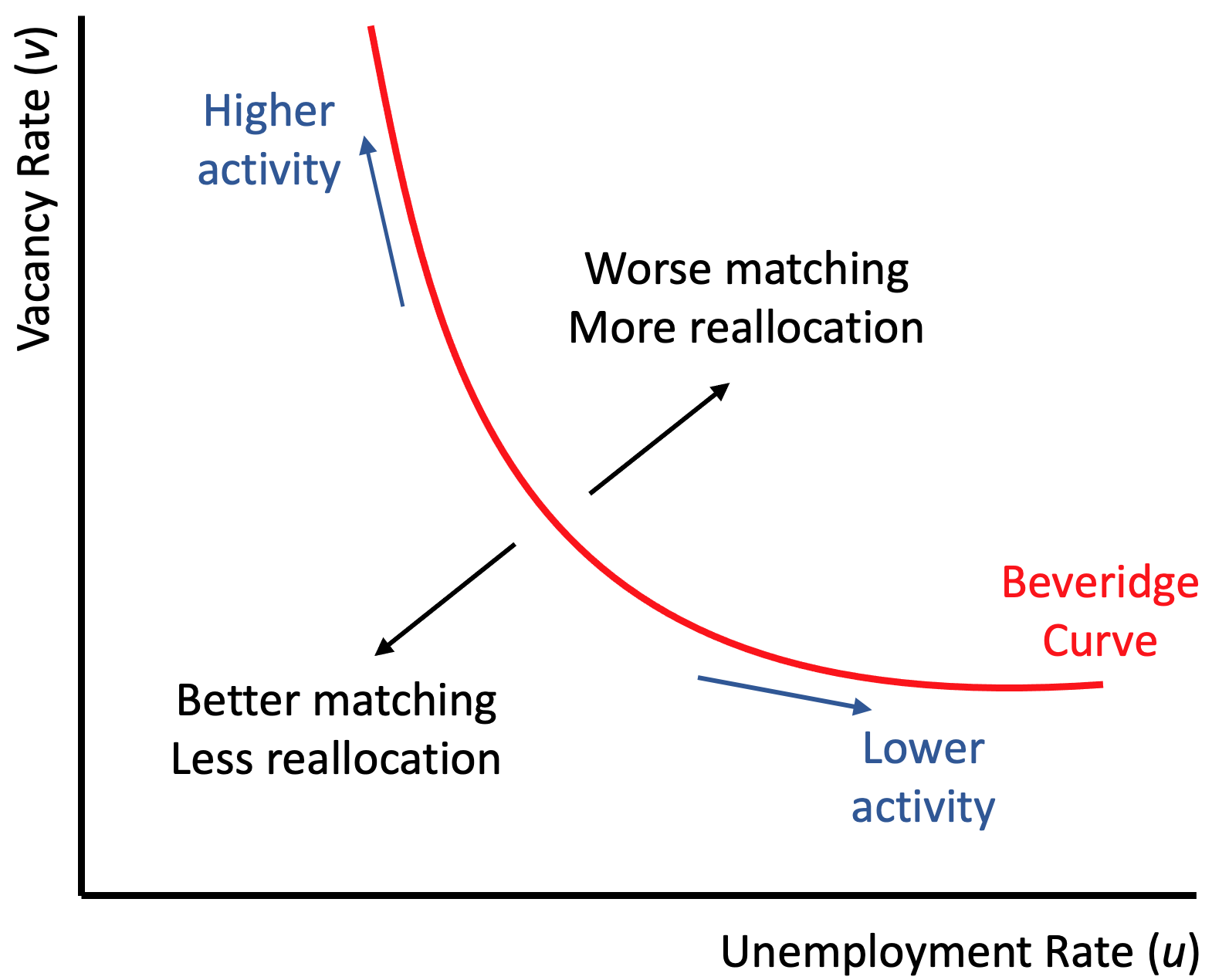
To understand the nature of the relationship, think about how the job market works. There are two groups: firms and workers. The firms have openings with specific requirements, so they post vacancies. The workers have a set of specific skills and are looking for appropriate jobs. The two groups then search until there is a match, at which point a firm hires the worker (see, for example, Blanchard and Diamond).
This process of searching and matching creates massive flows of people between the categories of employed and unemployed (as well as among the employed who switch jobs). To give a sense of the magnitude, in an average month in 2019 (prior to the pandemic), 5.83 million people were hired into new jobs, while 5.67 million people either quit or were fired, and there were 7.16 million vacancies posted. Thus, monthly gross hires were nearly 35 times the net changes in employment that year (about 170 thousand). As a result, over the course of 2019, out of a total labor force of roughly 164 million people, there were 70 million new hires! (Since many people change jobs while employed and some have more than one job at a time, this number for new hires far exceeds the 20 million people who exited unemployment in 2019.) We think of this extraordinary churning process as indicative of a flexible labor market that facilitates efficient matching between employers and workers.
Beveridge Curve in theory
Returning to the Beveridge curve, its two key properties are labelled in the previous figure. The first—the distance of the curve from the origin—reflects the difficulty that firms and workers have finding each other. We label this labor market efficiency. If structural (noncyclical) changes make it more difficult for workers and firms to find a match, the curve shifts out from the origin. Conversely, when the structure of the labor market facilitates matching, firms fill openings and workers find jobs quickly, so both vacancies and unemployment are low. While many factors influence the ease of matching, we highlight two: skills and location. Do workers have the skills that employers seek? And, are the workers located where employers need them? Large changes in production and the allocation of labor across activities and locations typically reduce the efficiency of the matching process, at least for a while.
The second property of the Beveridge curve concerns overall economic activity (or aggregate demand). Changes in overall activity lead to movements along the curve. As activity (demand) increases, vacancies rise and unemployment falls (regardless of the difficulty firms and workers usually have in finding each other). These cyclical changes account for the negative slope of the curve.
Importantly, there is a point on the curve associated with what we would call equilibrium or full employment in the labor market. Some people refer to this as the natural rate of unemployment (u*), a level of unemployment where there is neither upward nor downward pressure on wage growth. Put another way, there is a point on the Beveridge curve associated with stable inflation.
Beveridge Curve in practice
So, how does the Beveridge curve help us to understand the task that the Chair Powell and his colleagues face? To see, we construct a plot beginning in 1950. We include estimates of a fitted Beveridge curve for each of three 20-year intervals, 1950-1969, 1970-1989, and 1990-2009. We divide the more recent period into two, 2010-2019 and 2020 to now. Notice that, from the first to the second two-decade interval, the curve shifted substantially outward. That is, the light blue curve for the 1970-80s shows a substantially higher vacancy rate for every unemployment rate than the one for the 1950-60s. This is evidence of increased structural mismatch, and is consistent with the view that there was substantial labor reallocation in the aftermath of the oil price shocks of the 1970s, among other things. After the 1970-80s (light blue), matching efficiency improved in the 1990-2000s (light gray), but deteriorated somewhat following the great financial crisis (black line for the 2010s).
Beveridge curves in historical perspective (monthly), 1950-2022

Source: The unemployment rate is for the civilian labor force from FRED. Vacancy data for 1950 to 2002 are from Barnichon (2010), updated. Subsequent vacancy data are job openings from FRED. Trend lines are constructed by estimating ln(v)=a+bln(u). The large black dot for the 2010s uses the average of the CBO’s noncyclical rate of unemployment from FRED averaged over the decade. The large red circles are computed by assuming two different values for the equilibrium ratio of v/u.
Then came the pandemic. The scale of the recent outward shift in the Beveridge curve (in red) is unprecedented. Critically, however, we do not know if it will be permanent. For example, how much labor reallocation and mismatch will continue to result from the new trends of working from home, reduced business travel, and the streamlining and diversification of supply chains? Depending on the answer to these, and other questions, the economy will exhibit changes in the size and location of commercial real estate and of the production of intermediate inputs, the capacity of the public transportation system, and the scale of the hospitality industry, to name just a few. These structural adjustments will alter the use of labor.
Importantly, the Federal Reserve has no way to influence the efficiency of the labor market. Instead, their tools change the level of aggregate activity. Put differently, Fed policymakers can influence where the economy is along a given Beveridge curve, but they have no way to shift the curve itself.
Of course, the Beveridge curve may shift back on its own, as it did following the experience of the 1970s and 1980s. However, it is difficult to see why labor market efficiency would improve quickly anytime soon. Absent such an improvement, the combination of vacancies and unemployment is unlikely to move very far from the red curve in the previous chart. If that’s the case, then a sharp decline of vacancies can only come with a large rise of unemployment.
If the post-2020 Beveridge curve persists, how high might unemployment go to cool the economy enough to bring wage and price inflation back to pre-pandemic levels? The answer is that, to slow wage growth and inflation, the unemployment rate will need to go at least to the level consistent with full employment, u*, and probably higher.
So, what does the Beveridge curve tell us about the current u*? We start with the Congressional Budget Office’s estimate of the noncyclical rate of unemployment. Over the 2010s, the CBO estimates that u* averaged 4.7%. The Beveridge curve for this period (in black) implies a full employment vacancy rate, v*, of 3.9%. What about the period since 2020? To get an estimate, we make an assumption about the ratio v/u at full employment. We use two approaches to bracket the estimate. For the first, following Blanchard, Domash, and Summers, we assume that the labor market was in equilibrium in 2019, so that v*/u* is the average for the year, 1.2. The result is an estimate of u* equal to 4.8%—that is the large red circle to the left. For the second approach, we take v*/u* to be the level associated with the equilibrium in the 2010s (the large black dot), 0.83. This gives us the red circle to the right, where u* equals 6.3%. Comparing these two estimates to the current level of 3.6%, we conclude that the unemployment rate will have to rise by at least one percentage point, and possibly more than two, before wage inflation will moderate.
To sum up, the shift in the Beveridge curve represents a significant deterioration in the efficiency of the labor market, at least temporarily. This has two important implications: unless the curve quickly shifts back—something that the Fed does not control--vacancies will not fall far without a large increase in unemployment. Second, the full employment level of the unemployment rate could be as much as one and one-half percentage points higher than it was prior to the pandemic. So, if inflation is going to return to 2%, as the FOMC aims, we expect that it will come at a significant labor market cost.
UPDATE (3 August 2022): Following our July 25 post, we have updated the first and third charts to reflect the June vacancy rate that was reported on August 2. Separately, Figura and Waller and Blanchard, Domash and Summers have exchanged further views on the critical issue of the slope of the Beveridge curve (see here and here).